Google UX Design Project
As part of my Google UX Design project, I created an app for a fabricated florist. Below is a detailed look at how I created the app, along with my decisions behind the design.
Fuana’s Florist App
Amy Thomas
Created: February 22, 2024
Project Overview
The Product
With a few clicks of a button, you can have fresh flowers delivered right to your door with Fauna’s Florist app. We have integrated screen reader technology to make the process fast and efficient.
Project Duration
June 2023 to February 2024
The Problem
Fauna’s Florist wanted to increase sales and online traffic.
The Goal
Create an app that functions as a flower catalog while allowing customers to place online orders.
My Role
Lead UX designer and UX researcher
Responsibilities
User research, wireframing, prototyping, data collection and interpretation
User Research
Summary:
I conducted interviews and created user personas to empathize with my users and discover pain points.
The user group confirmed initial assumptions that in-app ordering is important, but research also revealed that users want flowers delivered directly to them. Other user problems included the need for screen reader compatibility and translation features, and/or clear and concise verbiage to make it understandable by all.
Understanding the User
1
Users are busy and cannot find time to schedule in-store pickup when their work hours conflict with shop hours
User Pain Points
2
Users are annoyed when they cannot see tiny verbiage that is not compatible with screen readers
3
Users who do not have previous knowledge about flowers don’t want the pressure of picking something out for loved ones
4
Users with language barriers hate having to maneuver in-person orders where they may not get the experience and product they need
Problem Statement:
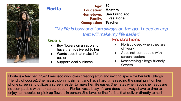
Forita is a dedicated teacher who needs an app to make her life easier because she has a tight schedule with endless responsibilities.
User Persona: Florita
Goals:
Make an easy-to-use and accessible app that allows for in-app informed purchases with scheduled delivery.
User Journey Map

Starting the Design
Paper Wireframes
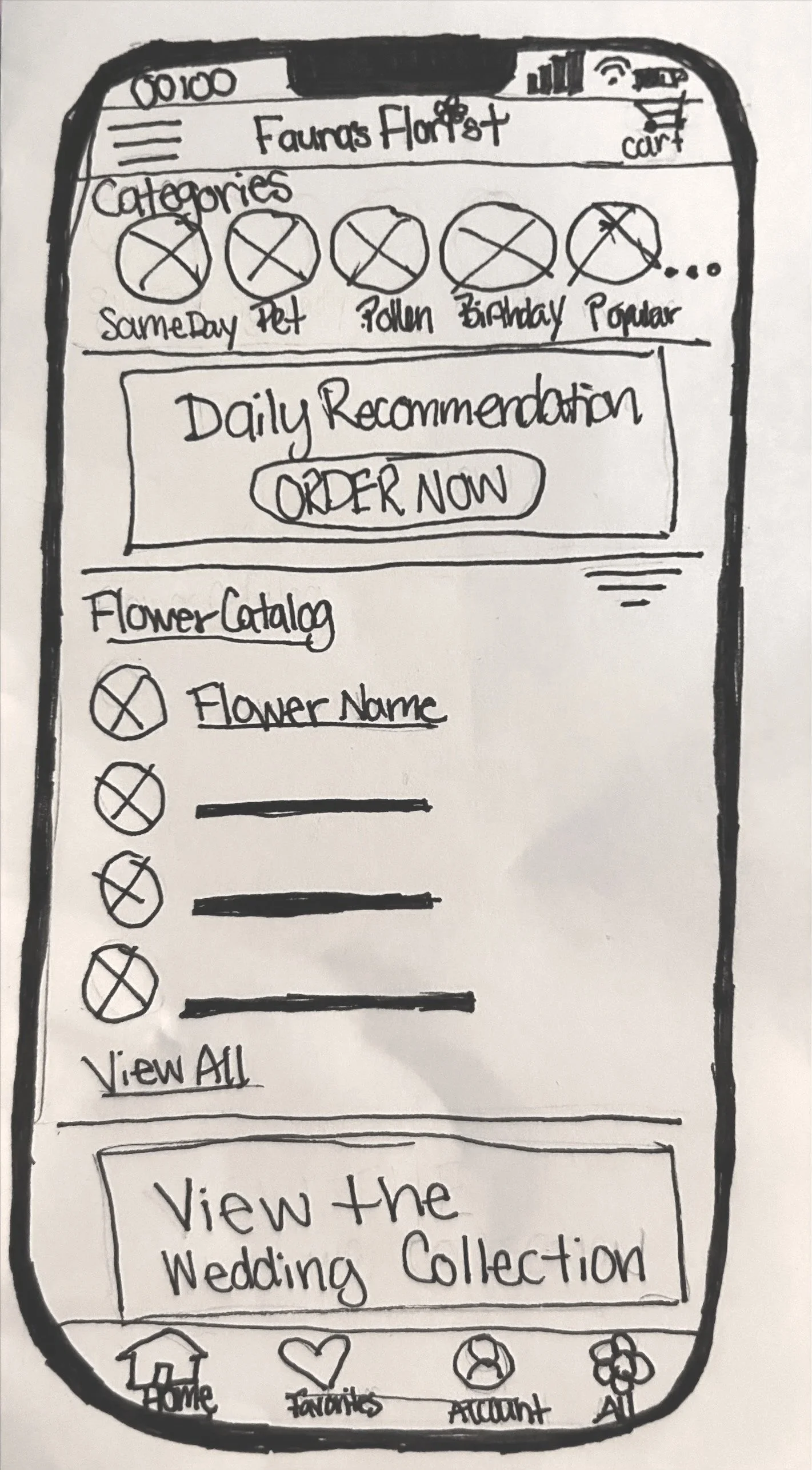
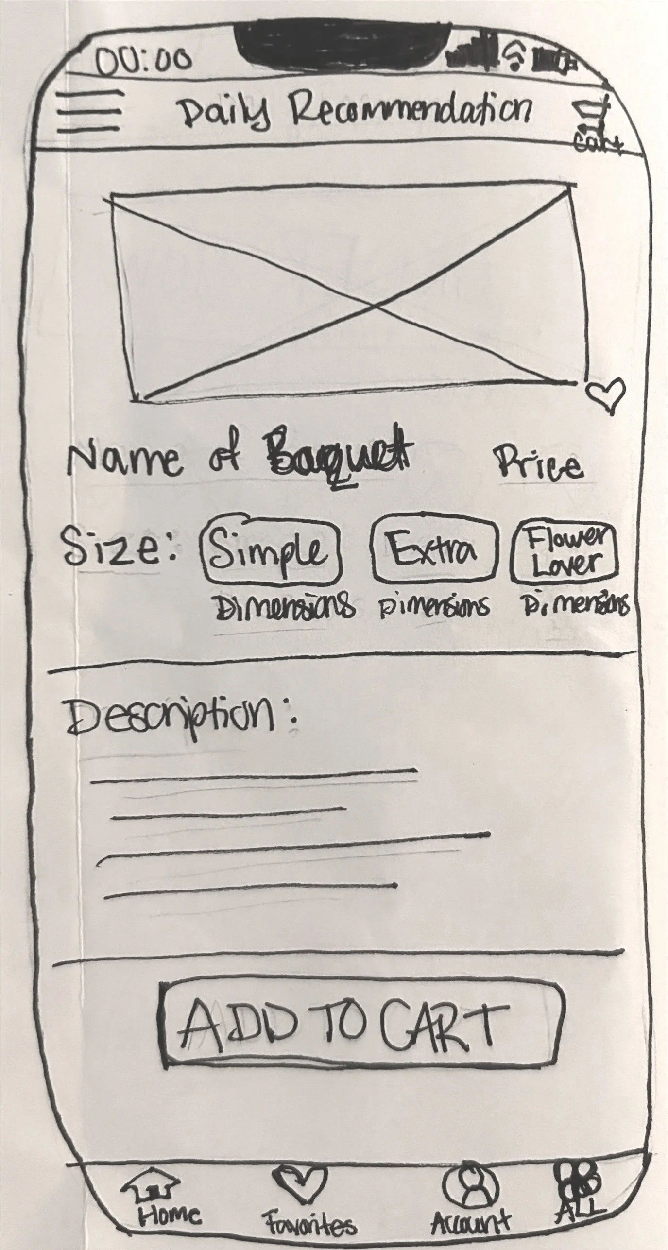
Mobile App:
My goal was to create wireframes that would mimic the process of ordering the Daily Recommendation.
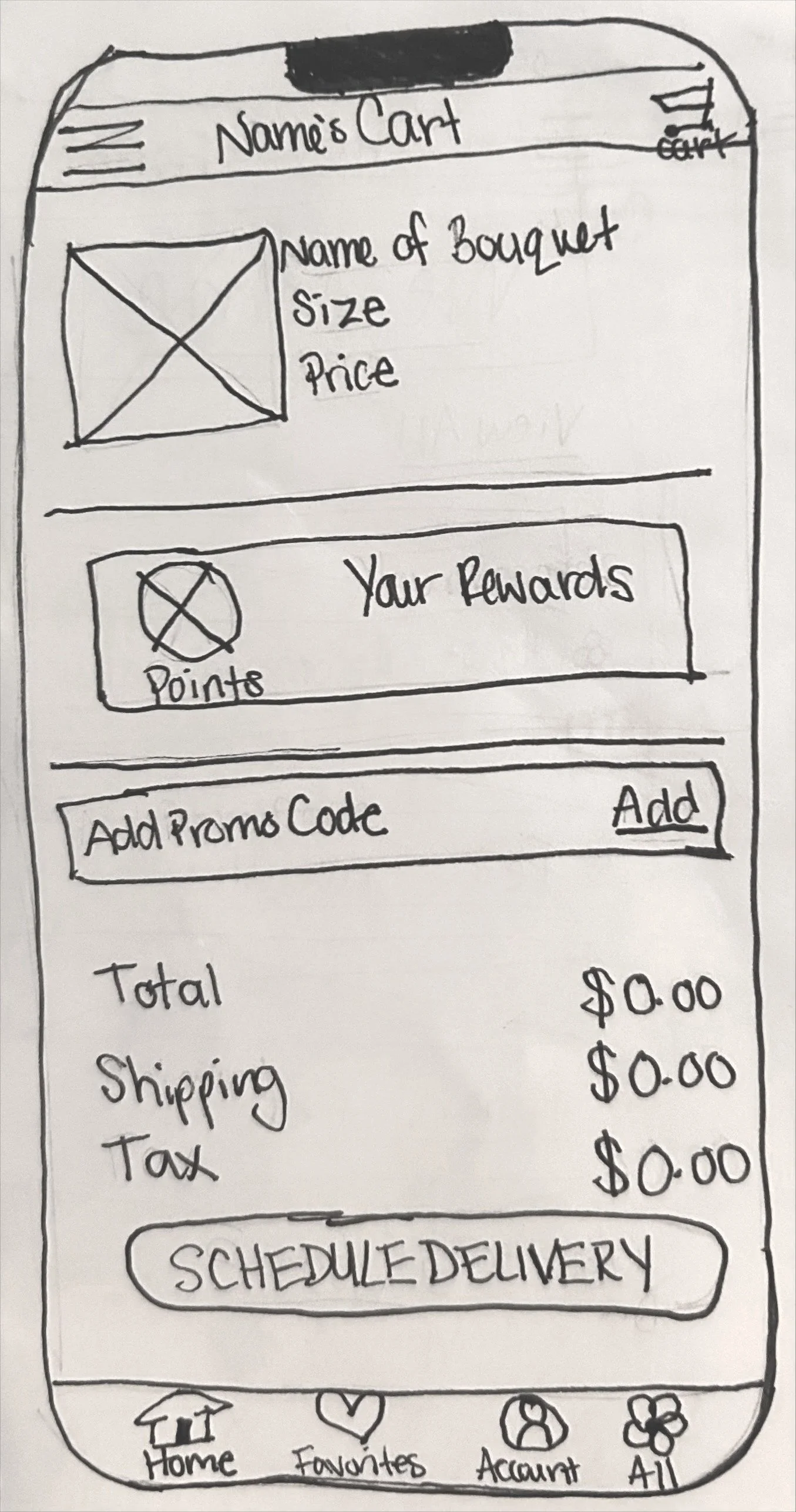
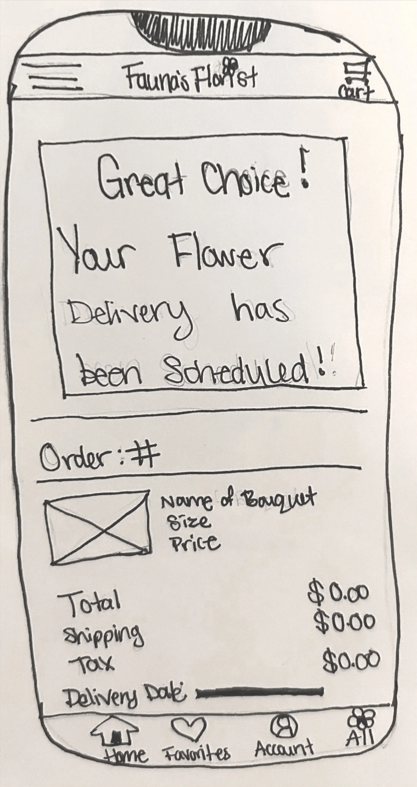
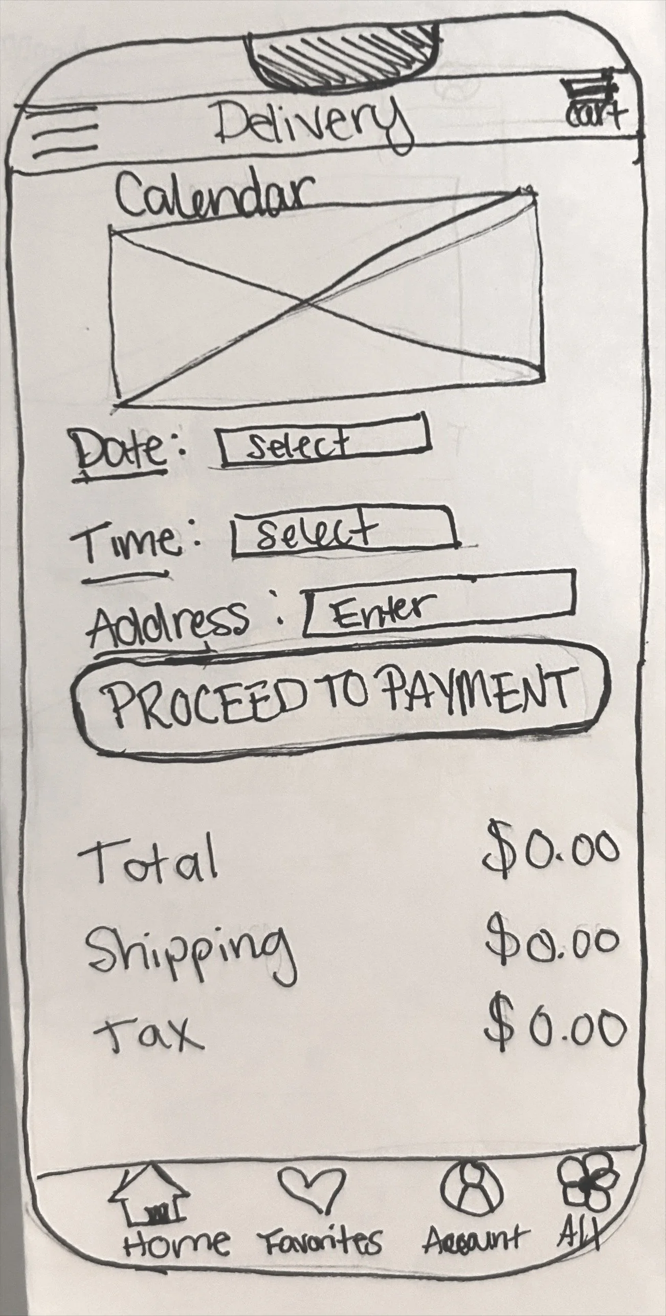
Desktop Webpage
My goal was to create wireframes that would mimic the process of ordering the Daily Recommendation.


Digital Wireframes
Mobile App:
I recreated my paper wireframe homescreen to add more detail and realism.
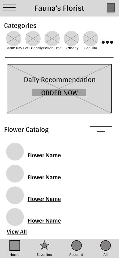
The Daily Recommendation is curated daily by the florist to provide customers with new and exciting options.
The categories are still at the top of the screen and the first thing customers will see.
The user cart has features to allow users to create custom delivery times and utilize rewards.
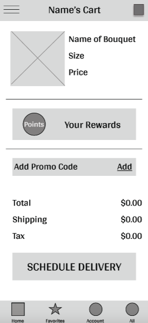
A points system has been added to reward customers for their purchases.
Schedule a delivery lets customers pick exact dates and time frames for delivery.
I recreated my paper wireframe homescreen to give it more detail and realism.
Desktop Webpage:

The Daily Recommendation is front and center to highlight the new and exciting option.
The categories are at the top as the first thing customers see and offer an array of thoughtful options.
The user cart has features to allow users to create custom delivery times and utilize rewards.
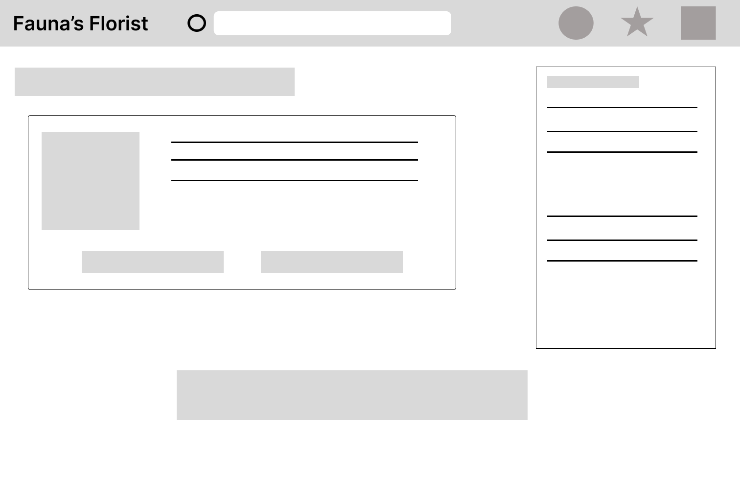
The points system is located on the right side of the screen, so customers always know what they have available.
The schedule a delivery option is at the bottom of the screen as the last step in the process.
Low-Fidelity Prototype
Mobile App
The low-fidelity prototype focuses on the process of ordering the daily recommendation.

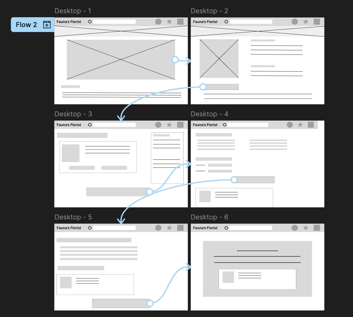
Desktop Webpage
The low-fidelity prototype focuses on the process of ordering the daily recommendation.
Usability Study: Findings
I conducted a usability study on 5 participants and asked them to complete a checkout process and find the favorites feature. Based on this study, these are my findings.
Users need clear pathways to navigate the app.
Users want language that is clear and encourages them to open a page.
Users want customization.
Round 1 Findings
Users found the size of the category and flower icons distracting.
Users want consistency.
Users want accessibility options.
Round 2 Findings
Refining the Design
Mockups
Mobile App
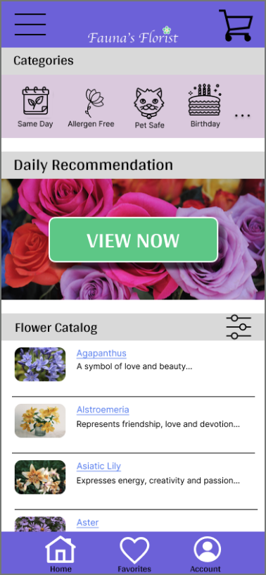
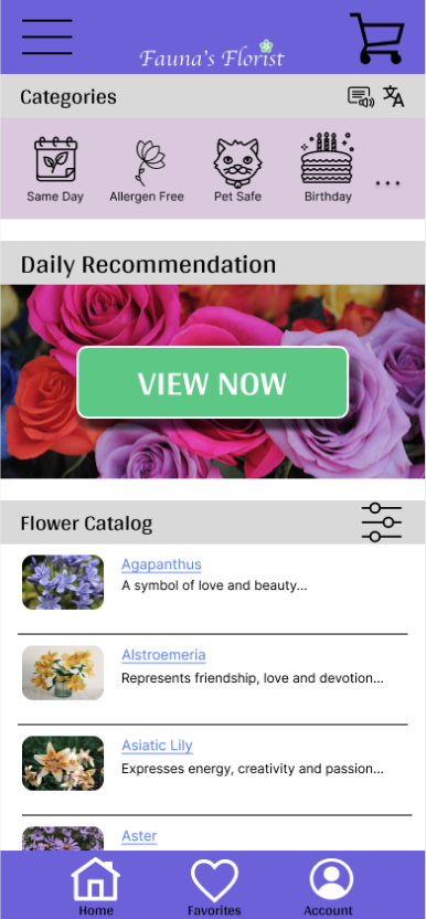
The usability studies I conducted determined the changes made to my mockups.
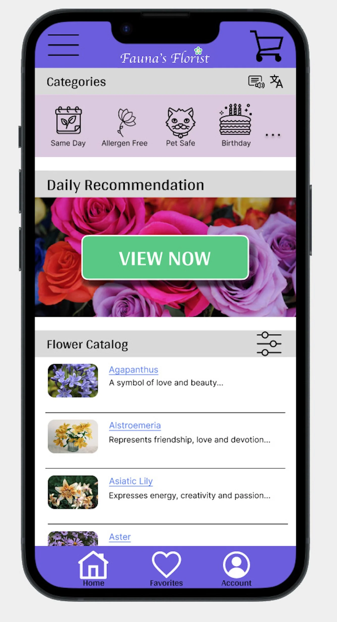
After the first iteration, I made the category icons and flower icons smaller to draw more attention to the daily recommendation.
After the second iteration, I added icons to indicate a built-in translation and screen reader function.
Before Usability Study
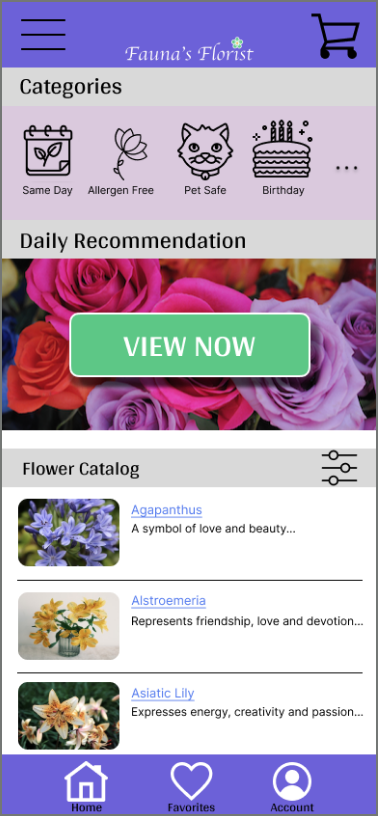
First Usability Study
Second Usability Study
Main User Flow
Mobile App

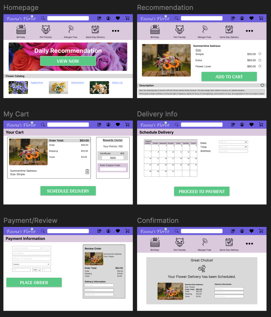
Main User Flow
Desktop Webpage
High-Fidelity Prototype
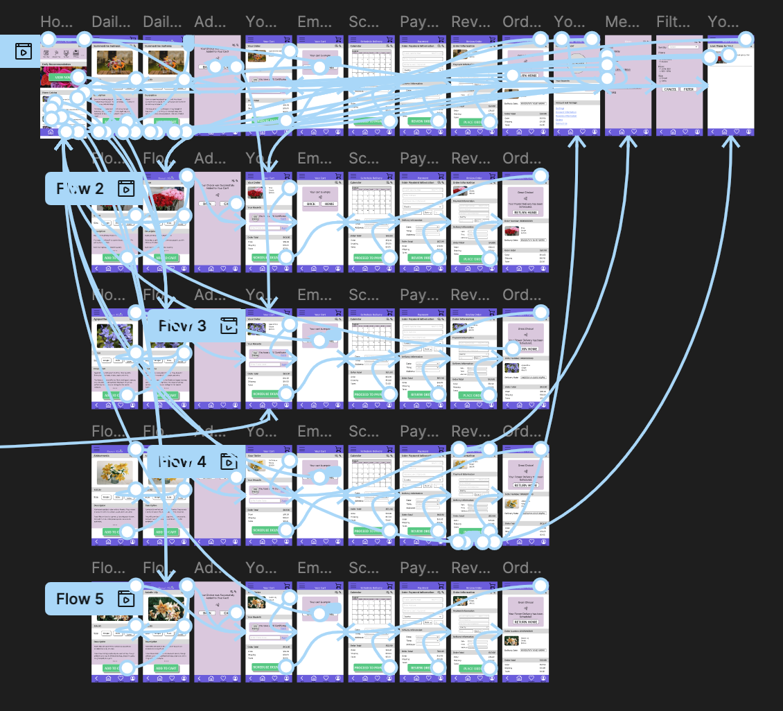
Mobile App
The high-fidelity prototype focuses on creating a simple user flow to order flowers and schedule a delivery.
High-Fidelity Prototype
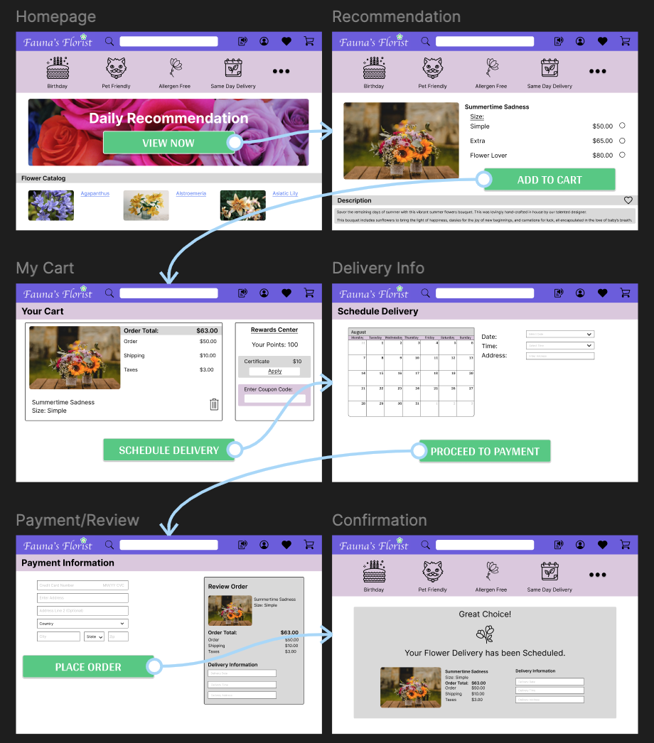
Desktop Webpage
The high-fidelity prototype focuses on creating a simple user flow to order flowers and schedule a delivery.
Accessibility Considerations
1
I have inserted an icon that represents language translation. I will work with the engineers to implement a built-in translation function for as many languages as feasible.
2
I have included an icon that represents a screen reader function. I will work with the engineers to incorporate a screen-reading functionality directly into the app.
3
I have included large text and contrasting colors to allow for vision accessibility. I have also made all action items pressable to ensure all users can move from one screen to another.
Going Forward
Takeaways
Impact
Participants in the usability study mentioned that the app is “easy to navigate and flows well, [and that they] would love to order flowers from this app!” (Participant C).
Participant B mentioned that they loved the colors of the app and ease of use.
What I Learned
I learned that layout is important when designing an app; too much info means clutter.
It is also important to consider user flow and how they move around the app. A back button was a crucial addition.
Next Steps
1
Create an all-encompassing, functional prototype version of this app.
2
Create a sticker sheet/design sheet to use for future projects.
3
Create overlays that slide over existing screens for easier functionality.